Layering and Blending
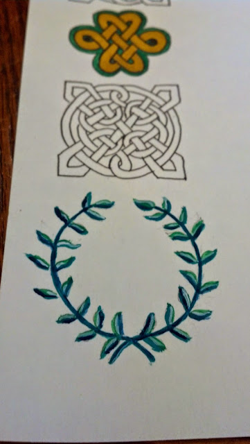
This is what I've learned over the years in art. For layering colors, start with a base color. Find another color slightly lighter of the same lineage for the 2nd. You'll add the 2nd color to your picture as highlights to make the picture pop better. You'll see in the Meridies greenery I used 2 main colors. Dark green and light green. Let it dry. Then you can go in with a much darker color. Instead of using a pen, I used a Prussian blue not black to darken up the stem and a little on the leaves. Let it dry again. This time add white with a tiny bristle brush or a tiny toothpick. You don't need much white. Too much will cause your picture too look awful. Watering the white down also helps. Add a bit of white on the surface of the object to make it look more realistic or pop even more.
The good thing with knots you can paint over lines in certain sections to stay within the knot. If you want to give a knot more dimension instead of looking just flat matte, find a paint color or a Pitt artist pen. The color needs to be close to your base color maybe just a shade darker but not much. A friend recommended to use a mustard color, which is period for viking colors. I have a gold Pitt pen. It gave it just a little dimensional blending only on the outer edges on certain ends of the piece. Let it dry and then re-apply your black ink to redraw the lines. If you used a 05 black archival pen originally, remember that regoing over lines will sometimes make it bigger on appearance. Which is what happened here. Use a smaller nib such as a 005 for reapplying. That also depends on your picture. With Viking it should be ok to use the same pen since some of their work was more bolder looking. If your doing flowers its best to go with a smaller nib. You can go back and add more of your gold or darker color just avoid the lines.


Greetings, Jenn. Great advice. I only dabble with doodle knot work and gouache. Love all of your illuminations and drawings.
ReplyDeleteRegards,
Rozani